Hello and welcome back to The Busy Business Owner’s Guide to Marketing! I am so thrilled you could join me again for another episode. Today, we are diving headfirst into a topic that I find absolutely fascinating, and one that holds so much untapped potential for your business: The Psychology of Pricing and, crucially, how to present it on your website.
Now, you might think of pricing as just a number—a simple calculation of your costs plus a desired profit margin. But what I’ve learned over years of working with incredible business owners just like you is that pricing is so much more. It’s a critical marketing signal. It’s a silent conversation you’re having with your customer that communicates your value, your confidence, and your brand’s position in the market before they even read a single feature.
The best part? You don’t need a massive marketing budget or a team of data scientists to get this right. Stick with me, because today we’re going to explore how a few small, strategic changes in how you present your prices can lead to some truly significant, and often surprising, increases in your sales. Ready? Let’s get into it.
The Big Three: Psychological Pricing Tactics
Before we can build the perfect pricing page, we need to understand the powerful cognitive biases that influence how your customers perceive value. Let’s walk through my big three concepts together.
1. Price Anchoring
Let me paint a vivid picture. Imagine walking into a high-end boutique. The first thing you see is a stunning handbag with a $2,000 price tag. You gasp. But then, as you browse, you find a beautiful wallet for $200. Suddenly, that wallet doesn’t seem so expensive, does it? In fact, it feels like a bargain! That, my friends, is price anchoring.
The first price a customer sees subconsciously sets the standard for everything that follows. My unbreakable rule for a pricing page? Always show your premium package first, from left to right. When a visitor first lays eyes on your $200 ‘Ultimate’ plan, your $80 ‘Standard’ plan suddenly feels incredibly reasonable and packed with value by comparison. You’ve anchored their perception of cost to a higher number, making your intended target option look like a fantastic deal.
2. The Clever Decoy Effect
This one is so smart it almost feels like a magic trick. The Decoy Effect involves creating a third option that is intentionally less attractive, designed purely to make one of your other options look like an absolute no-brainer.
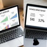
Think about the classic movie theater popcorn pricing. A small is $6, a medium is $9, and a large is $9.50. The medium is the decoy! Almost no one buys it. Its job is to make the large look like an amazing deal—for just 50 cents more, you get so much more popcorn. On your website, this could look like a ‘Basic’ plan for $45 with very few features, placed right next to your ‘Pro’ plan for $50 that’s just bursting with value. The choice becomes obvious. You’re not just presenting options; you’re architecting a decision.
3. Charm Pricing (The Power of 9)
This is a classic for a reason—because it works. You’ve seen it everywhere, from your local grocery store to massive online retailers: prices ending in .99 or .95. Our brains have a funny quirk where we read from left to right, so we anchor on that first digit. A price tag of $99 feels psychologically and emotionally much, much cheaper than $100. Even though we logically know it’s only a dollar difference, the feeling of getting something in the “ninety-something” range is far more appealing than crossing that three-digit threshold. It’s a simple trick, but you might find it’s incredibly effective.
Designing Your Pricing Page to Guide, Not Overwhelm
Okay, with those psychological tools in our pocket, let’s talk about the practical design of your pricing page. A poorly designed page can undo all your hard work.
The ‘Good, Better, Best’ Sweet Spot
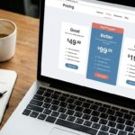
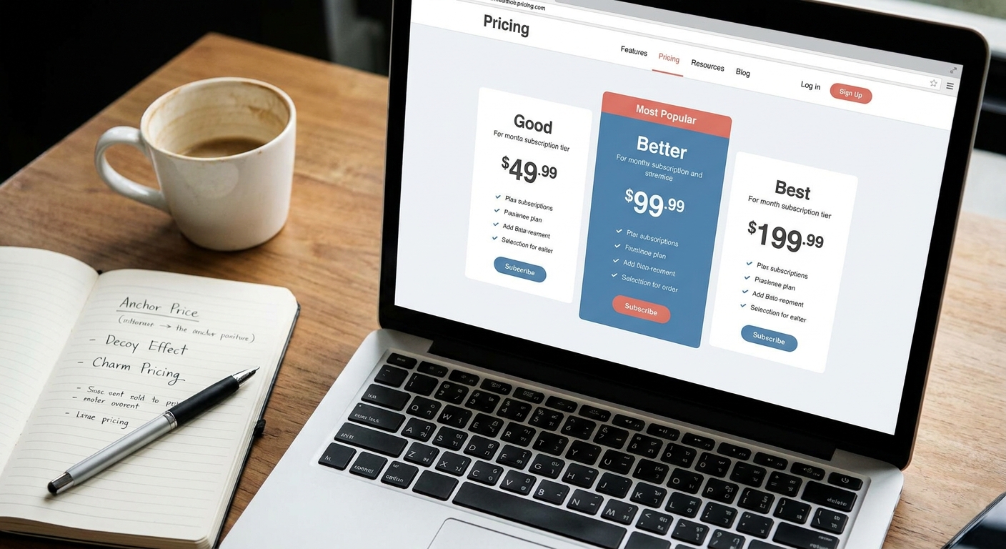
What I love to see is a simple, clear, three-tiered structure. It’s intuitive and helps customers quickly categorize their needs. But here’s the secret sauce: you must visually guide your customer to the option you want them to choose.
I once worked with a wonderful client who had three perfectly fine packages laid out in three identical-looking columns. Sales were just… okay. We made a few simple tweaks. We made their middle ‘Better’ option physically a little larger than the others, gave it a distinct background color, and added a simple, eye-catching banner that said ‘Most Popular.’ That one set of changes boosted sales for that specific plan by over 40% in the first month! It’s not about manipulation; it’s about making the best choice the easiest choice.
My personal rule of thumb? Limit your options. Three is the magic number. Four is pushing it. Five or more and you risk triggering ‘analysis paralysis,’ that awful feeling of being so overwhelmed with choices that you make no choice at all. A confused mind doesn’t buy—it just clicks away.
From Cost to Value: Changing the Conversation
This might be the most important shift you can make. Your pricing page shouldn’t just be a list of costs and features; it should be a powerful sales page that screams value.
- Translate Features into Benefits: I see this all the time—a list of technical specs like ’10GB of storage’ or ’24/7 email support.’ What does that actually mean for your customer? You’ll find it works much better to translate that into an emotional benefit. Instead of the spec, try: ‘Store thousands of your precious family photos safely’ or ‘Enjoy the peace of mind knowing we’re here to help, anytime.’ See the difference? One is a number, the other is a solution to a problem.
- Show, Don’t Just Tell, with Social Proof: Why should a customer trust that your price is fair? Because other people just like them already have! What I love to see is social proof placed directly on the pricing page. A short, powerful testimonial or a few logos of happy clients right underneath your packages can do more to justify your price than any feature list ever could.
- Frame the Cost Relatably: Is your service $30 a month? That can feel like a commitment. But what if you frame it as ‘For less than the price of a cup of coffee a day’? Suddenly, that monthly fee feels so much more manageable and trivial. This reframing helps the customer mentally categorize the expense as a small, everyday purchase rather than a significant monthly bill.
My Final Tip: You Have to Test!
I can give you all the best practices and psychological principles in the world, but the ultimate truth will come from your audience. The most crucial part of my process is to constantly be testing.
Don’t just set your prices and forget them. Run simple A/B tests. For two weeks, try highlighting your middle tier. For the next two, try charm pricing on all your plans. Test a price point of $49 versus $55. You might find that your audience responds in ways you never, ever expected. Data is your absolute best friend here, and it will guide you toward the most profitable strategy for your unique business.
Let’s Wrap It Up
So, as we bring this conversation to a close, what I always come back to is this: pricing isn’t just math; it’s a powerful and fascinating psychological tool. You don’t have to be a pricing expert to make a huge impact. By implementing simple tactics like price anchoring, designing a page that guides your customer to the best choice, and above all, always focusing on communicating the incredible value you offer, you can transform your pricing page from a simple menu into a high-converting sales machine.
Thank you so much for joining me today. I truly hope this has sparked some new ideas for you.
Next time, we’ll be building directly on this foundation as we explore ‘From Passive Follower to Active Lead: The Critical Role of the Call-to-Action.’ We’ve just nailed presenting our value; now let’s convert that interest into tangible action!
Until then, what pricing strategies have worked for you? Drop your thoughts and questions in the comments below—I’d love to hear from you!